
Landing page for a summer camp
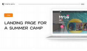
«Mriya» is a private lyceum and kindergarten in Odesa, Ukraine. They usually organize a summer camp on their territory and open it for everyone who wants to join. International camps were also opened in Greece and Bulgaria this year.
Task: to develop a modern site that will convey the mood of the camp to children and their parents and convince them of safety and reliability.
Our work consisted of the following stages:
- Analysis of competitors
- Defining the target audience
- Preparation of 2 variants of site concepts
- Design and development
ANALYSIS OF COMPETITORS
We conducted an analysis of summer camps in Odesa and other regions. We have noticed:
- an offer used by competitors taking into account martial law in Ukraine;
- features in the design;
- content into the site: what blocks were used.
- Based on the results, we created a table where emphasized what could be used to advertise the client's camp.
DETERMINATION OF THE TARGET AUDIENCE
The target audience of the camp is parents, mostly mothers, of children aged 6 to 15 years. For a better understanding, we conducted several interviews with the camp team and found out who is their typical client, what questions are most often asked by parents and why they choose «Mriya» in particular.
PREPARATION OF 3 OPTIONS OF WEBSITE CONCEPTS
Understanding how competitors operate and who the camp's target audience is, we began packaging the value proposition on the site.
Difficulties
- The design of the main site is morally outdated, so we developed 3 landing concepts about the camp from 0.
- Lack of prescribed conditions and information from the camp. We had to create what to write;
- Main site infected with viruses;
- Terms for design and development - 1 week.


Decision
- Thanks to interviews with the camp team, we understood what issues parents are most interested in. The answers were described on the website: the program, food and safety issues.
- A slider was placed on the first screen to show the main activities of the camp during the shift.
- Photo cards conveyed the summer mood and fun. We have used only real photos of children who attended the camp last year.
- We completely updated the CMS of the main site, added some functions to eliminate the vulnerability of the system.
Thanks to regular and quick feedback from the camp team, we managed to develop a landing page in a short time that conveyed the mood and answered the main questions of parents.


It's free and takes 2 minutes. There are 1500+ digital agencies in the catalog that are ready to help in the implementation of your tasks. Choose and save up to 30% on time and budget!



«Mriya» is a private lyceum and kindergarten in Odesa, Ukraine. They usually organize a summer camp on their territory and open it for everyone who wants to join. International camps were also opened in Greece and Bulgaria this year.
Task: to develop a modern site that will convey the mood of the camp to children and their parents and convince them of safety and reliability.
Our work consisted of the following stages:
- Analysis of competitors
- Defining the target audience
- Preparation of 2 variants of site concepts
- Design and development
ANALYSIS OF COMPETITORS
We conducted an analysis of summer camps in Odesa and other regions. We have noticed:
- an offer used by competitors taking into account martial law in Ukraine;
- features in the design;
- content into the site: what blocks were used.
- Based on the results, we created a table where emphasized what could be used to advertise the client's camp.
DETERMINATION OF THE TARGET AUDIENCE
The target audience of the camp is parents, mostly mothers, of children aged 6 to 15 years. For a better understanding, we conducted several interviews with the camp team and found out who is their typical client, what questions are most often asked by parents and why they choose «Mriya» in particular.
PREPARATION OF 3 OPTIONS OF WEBSITE CONCEPTS
Understanding how competitors operate and who the camp's target audience is, we began packaging the value proposition on the site.
Difficulties
- The design of the main site is morally outdated, so we developed 3 landing concepts about the camp from 0.
- Lack of prescribed conditions and information from the camp. We had to create what to write;
- Main site infected with viruses;
- Terms for design and development - 1 week.
Decision
- Thanks to interviews with the camp team, we understood what issues parents are most interested in. The answers were described on the website: the program, food and safety issues.
- A slider was placed on the first screen to show the main activities of the camp during the shift.
- Photo cards conveyed the summer mood and fun. We have used only real photos of children who attended the camp last year.
- We completely updated the CMS of the main site, added some functions to eliminate the vulnerability of the system.
Thanks to regular and quick feedback from the camp team, we managed to develop a landing page in a short time that conveyed the mood and answered the main questions of parents.