
New Web Design For the Financial Company: E-Groshi Case
About the Client in Short
E-Groshi, a financial institution, understand the significance of a well-designed website, thus, in August 2021, approached WEZOM for assistance. Their request was to revamp the present website and WEZOM responded quickly, thus beginning the collaboration. Let's explore the difficulties WEZOM encountered and the outcomes they achieved.
Statistics from Statista reveal that the majority of site visits (54.8%) in the first part of 2021 came from mobile devices. This emphasizes the importance of focusing on mobile development and design.
Request to WEZOM
The company had its own development team, but they decided to seek the advice of an external company. Our team was involved in this project:
- UI designer
- UX designer
- Project Manager
The Team Lead, IT Sales Manager, Art Director, and Sales Manager all discussed all the stages and the Sales Manager was the first to contact the client. On the client's side, there were more than five people involved, excluding the developers.
The importance of an updated site is well understood by the client, so the request in detail was as follows:
-Request number one was to update the design. The request was to change the UI and UX design. The client wanted to completely update the site’s structure, making it more user-friendly. E-Groshi team also wanted to provide its client with an easy experience of getting loans.
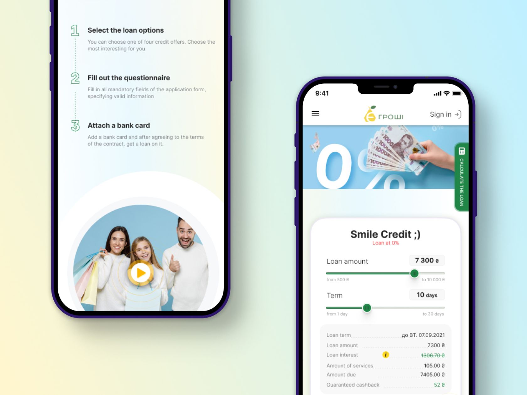
-Request number two. Update the mobile version of the site. According to the statistics above, 3 out of 5 customers will use the mobile version of the site rather than download the page on a PC.
-Request number three. The main goal of a renovated site was to increase audience loyalty. With a good website or landing page, users are much more likely to use the site's services. At this stage, the company helped WEZOM’s team to better understand their client’s needs.
The client's main objective was to create a more user-friendly site for their loyal customers. After a meeting with the customer, a brief from our company was made, taking into account the future structure, the demonstration of the proposal and the signing of the contract. This is how the project to improve the microcredit platform's website started.
Project steps & Solution
It has been reported by Top Design Firms 2021 that if a website does not have good performance, 42% of visitors will abandon it.
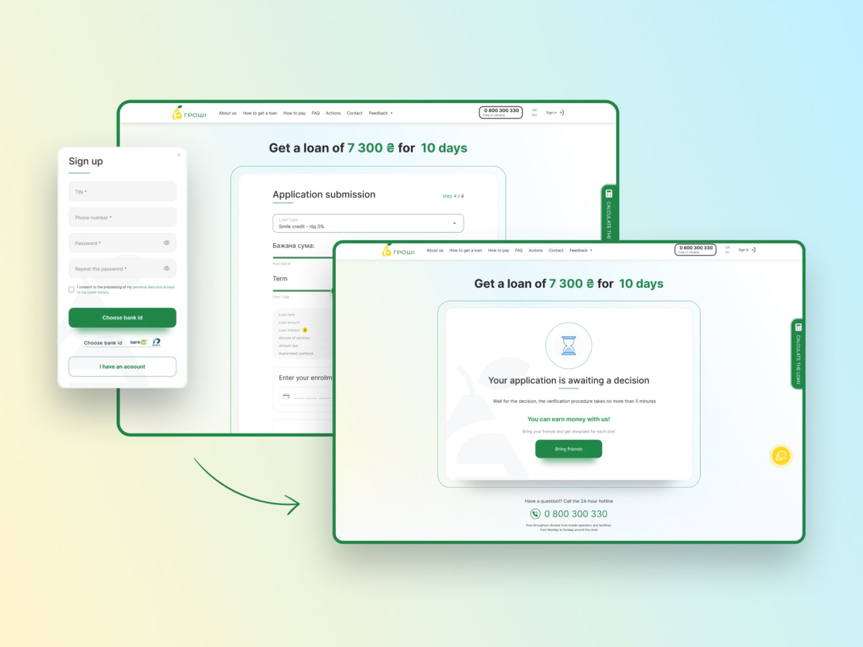
1.Structure development. We had to take into account the essential nuances of working with the site for microcredit. For example, on the first screen of the site, there should be a calculator that would calculate the interest rate when choosing the loan amount according to E-Groshi.
2.The design of the PC version of the site. The second phase was to design and create a unique site for the page. This phase includes the design process to achieve the most acceptable result for the client.
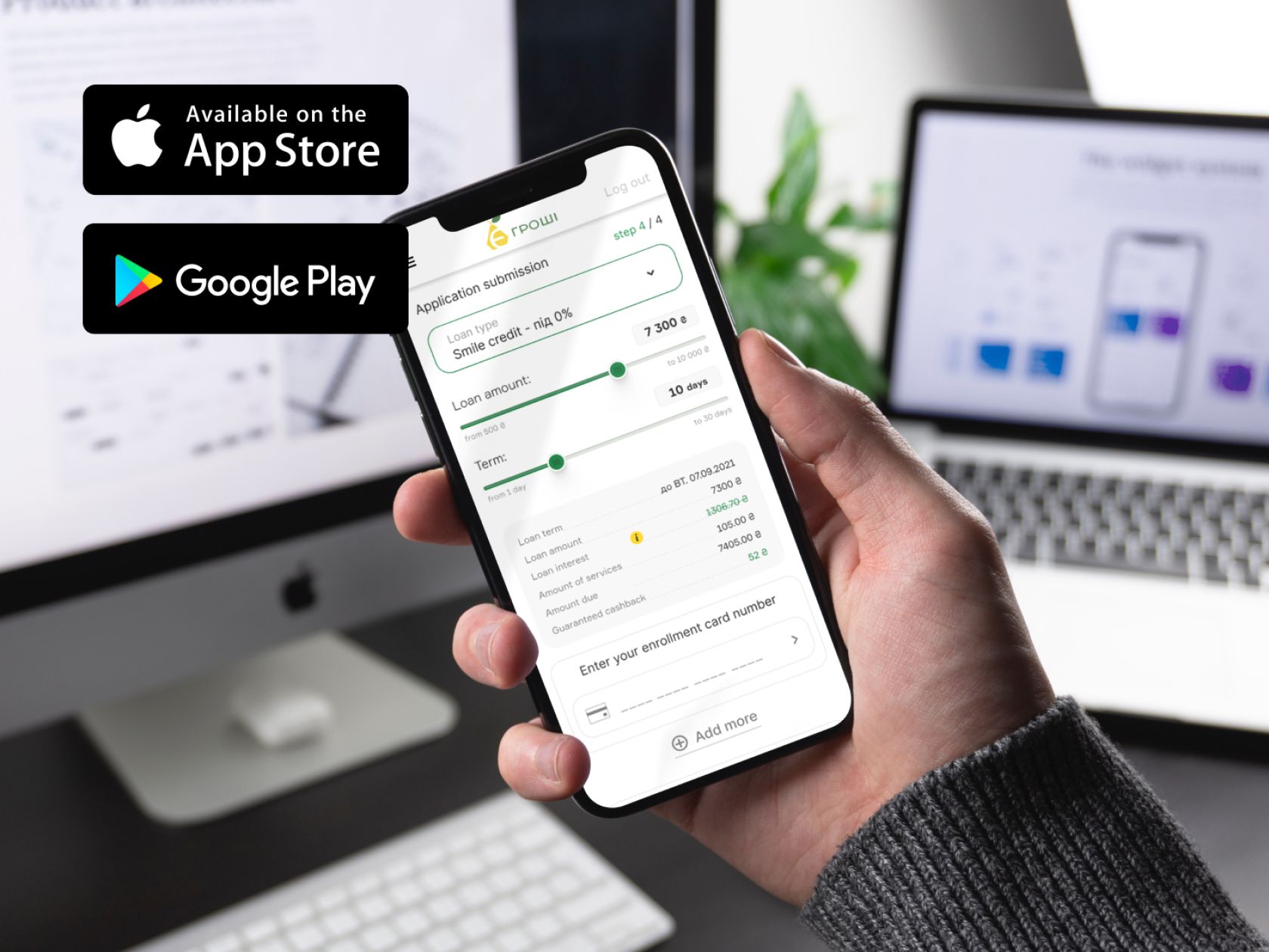
3.Design of the mobile version. As the majority of users open the site via we paid especial attention to the mobile version.
The website design was completed promptly, although some difficulties arose that did not impede the completion of the task.
Main challenges
Soon after we began our project, major issues arose. We strive to offer a personalized service to each customer, so we focused on the primary expectations of the customer when constructing the website
New Logo
The client was eager to come up with a new logo for the business. Several possibilities were presented, but the client decided to maintain the existing logo and implement it on the new website. Our team provided three distinct logos, but the client was uncertain whether to switch or stay with the existing one. The logos our team produced can be used at a later date.
Use of Brand’s Color
The client insisted that the old website's color palette be retained for the new design. It was not a restriction for our team, but rather a set of requirements that had to be followed.
New Calculator Design
The client's second major request was to develop a new calculator on the website. It was essential to upgrade the existing calculator to make it more user-friendly and incorporate the brand's colors.
Results: New Fresh Site
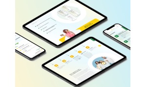
Our team was able to establish a distinct design within a 15-month time frame. We also crafted a distinct vocal style for E-Groshi, which is still in use today. We developed a UI/UX design that was straightforward for the service's customers, with the addition of the company's specific colors. Additionally, we constructed a top-notch mobile version of the website. In a period of one and a half months, we accomplished three phases of work that positively impacted the E-Groshi service.
It's free and takes 2 minutes. There are 1500+ digital agencies in the catalog that are ready to help in the implementation of your tasks. Choose and save up to 30% on time and budget!





About the Client in Short
E-Groshi, a financial institution, understand the significance of a well-designed website, thus, in August 2021, approached WEZOM for assistance. Their request was to revamp the present website and WEZOM responded quickly, thus beginning the collaboration. Let's explore the difficulties WEZOM encountered and the outcomes they achieved.
Statistics from Statista reveal that the majority of site visits (54.8%) in the first part of 2021 came from mobile devices. This emphasizes the importance of focusing on mobile development and design.
Request to WEZOM
The company had its own development team, but they decided to seek the advice of an external company. Our team was involved in this project:
- UI designer
- UX designer
- Project Manager
The Team Lead, IT Sales Manager, Art Director, and Sales Manager all discussed all the stages and the Sales Manager was the first to contact the client. On the client's side, there were more than five people involved, excluding the developers.
The importance of an updated site is well understood by the client, so the request in detail was as follows:
-Request number one was to update the design. The request was to change the UI and UX design. The client wanted to completely update the site’s structure, making it more user-friendly. E-Groshi team also wanted to provide its client with an easy experience of getting loans.
-Request number two. Update the mobile version of the site. According to the statistics above, 3 out of 5 customers will use the mobile version of the site rather than download the page on a PC.
-Request number three. The main goal of a renovated site was to increase audience loyalty. With a good website or landing page, users are much more likely to use the site's services. At this stage, the company helped WEZOM’s team to better understand their client’s needs.
The client's main objective was to create a more user-friendly site for their loyal customers. After a meeting with the customer, a brief from our company was made, taking into account the future structure, the demonstration of the proposal and the signing of the contract. This is how the project to improve the microcredit platform's website started.
Project steps & Solution
It has been reported by Top Design Firms 2021 that if a website does not have good performance, 42% of visitors will abandon it.
1.Structure development. We had to take into account the essential nuances of working with the site for microcredit. For example, on the first screen of the site, there should be a calculator that would calculate the interest rate when choosing the loan amount according to E-Groshi.
2.The design of the PC version of the site. The second phase was to design and create a unique site for the page. This phase includes the design process to achieve the most acceptable result for the client.
3.Design of the mobile version. As the majority of users open the site via we paid especial attention to the mobile version.
The website design was completed promptly, although some difficulties arose that did not impede the completion of the task.
Main challenges
Soon after we began our project, major issues arose. We strive to offer a personalized service to each customer, so we focused on the primary expectations of the customer when constructing the website
New Logo
The client was eager to come up with a new logo for the business. Several possibilities were presented, but the client decided to maintain the existing logo and implement it on the new website. Our team provided three distinct logos, but the client was uncertain whether to switch or stay with the existing one. The logos our team produced can be used at a later date.
Use of Brand’s Color
The client insisted that the old website's color palette be retained for the new design. It was not a restriction for our team, but rather a set of requirements that had to be followed.
New Calculator Design
The client's second major request was to develop a new calculator on the website. It was essential to upgrade the existing calculator to make it more user-friendly and incorporate the brand's colors.
Results: New Fresh Site
Our team was able to establish a distinct design within a 15-month time frame. We also crafted a distinct vocal style for E-Groshi, which is still in use today. We developed a UI/UX design that was straightforward for the service's customers, with the addition of the company's specific colors. Additionally, we constructed a top-notch mobile version of the website. In a period of one and a half months, we accomplished three phases of work that positively impacted the E-Groshi service.