
Branding for an international online payment system
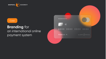
TomPay is an international online payment system that allows users to pay with cards anywhere: on websites, in applications, or messengers.
Shapoval Agency was approached for the logo design, corporate identity, and design the main brand manifestation.
BRAND PLATFORM
The style was to be strictly minimalist to symbolize reliability, accessibility, and convenience.
After brainstorming, we invented the symbol of the service – a satellite. Satellites accompany the planets, and our service will accompany users wherever they are.
TomPay is a reliable satellite for your payments.
CONCEPT OF VISUAL IDENTIFICATION
Logotype
Text-graphic: icon (simplified image of the satellite) and the name of the service. The icon can be used as a separate element, but the text only with the icon.
There are two versions of the logo: white and black.

Corporate colors
The most strict: light gray and graphite, as an additional color is allowed to use pink.

Fonts
We used the Cavalero font for the logo. It is a beautiful square serif font, an ultra-extended font that is ideal for digital use.
Alegreya Sans Bold for headlines and popular Play for body text were chosen as text fonts.

BRANDING PRODUCTS


SOCIAL NETWORKS


WEBSITE AND APP


More cases on our Behance.
It's free and takes 2 minutes. There are 1500+ digital agencies in the catalog that are ready to help in the implementation of your tasks. Choose and save up to 30% on time and budget!


TomPay is an international online payment system that allows users to pay with cards anywhere: on websites, in applications, or messengers.
Shapoval Agency was approached for the logo design, corporate identity, and design the main brand manifestation.
BRAND PLATFORM
The style was to be strictly minimalist to symbolize reliability, accessibility, and convenience.
After brainstorming, we invented the symbol of the service – a satellite. Satellites accompany the planets, and our service will accompany users wherever they are.
TomPay is a reliable satellite for your payments.
CONCEPT OF VISUAL IDENTIFICATION
Logotype
Text-graphic: icon (simplified image of the satellite) and the name of the service. The icon can be used as a separate element, but the text only with the icon.
There are two versions of the logo: white and black.
Corporate colors
The most strict: light gray and graphite, as an additional color is allowed to use pink.
Fonts
We used the Cavalero font for the logo. It is a beautiful square serif font, an ultra-extended font that is ideal for digital use.
Alegreya Sans Bold for headlines and popular Play for body text were chosen as text fonts.
BRANDING PRODUCTS
SOCIAL NETWORKS
WEBSITE AND APP
More cases on our Behance.