
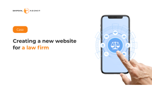
New website for a law firm
A website for a law firm is a visiting card of the company. For the service of online consultations with lawyers, is the main tool for attracting clients.
Shapoval Agency was contacted by such a client with the task of finalizing an existing website. The main wishes were to simplify the work with the site, make a modern design and, as a result, increase the number of leads.
After analyzing the site, we had found the following "weak points":
- The site was built on Angular, so it was required a lot of time and resources from programmers to make changes.
- All areas of the law were revealed at first page, which made the site difficult and inconvenient for the user.
- The benefits of online lawyers had not been sufficiently disclosed.
What we had implemented:
- Had developed a new website design. Blue colors were used as they are associated with safety and help.
- Had developed a new site structure based on SEO audit. The site was completely ready for search engine optimization.
- Improved site navigation: implemented a search, focused on several areas of law, separately identified possible packages of consultations with a lawyer.
- Add a block with a comparison of an ordinary lawyer and an online lawyer.
- Implemented three language versions: Ukrainian, Russian, and English.
As a result: only in three months the time spent on the site had increased by 56% (from 2:02 to 3:10)


More cases on our Behance.
It's free and takes 2 minutes. There are 1500+ digital agencies in the catalog that are ready to help in the implementation of your tasks. Choose and save up to 30% on time and budget!






A website for a law firm is a visiting card of the company. For the service of online consultations with lawyers, is the main tool for attracting clients.
Shapoval Agency was contacted by such a client with the task of finalizing an existing website. The main wishes were to simplify the work with the site, make a modern design and, as a result, increase the number of leads.
After analyzing the site, we had found the following "weak points":
- The site was built on Angular, so it was required a lot of time and resources from programmers to make changes.
- All areas of the law were revealed at first page, which made the site difficult and inconvenient for the user.
- The benefits of online lawyers had not been sufficiently disclosed.
What we had implemented:
- Had developed a new website design. Blue colors were used as they are associated with safety and help.
- Had developed a new site structure based on SEO audit. The site was completely ready for search engine optimization.
- Improved site navigation: implemented a search, focused on several areas of law, separately identified possible packages of consultations with a lawyer.
- Add a block with a comparison of an ordinary lawyer and an online lawyer.
- Implemented three language versions: Ukrainian, Russian, and English.
As a result: only in three months the time spent on the site had increased by 56% (from 2:02 to 3:10)
More cases on our Behance.