
12 factors that can drive visitors away from your mobile site

Elit-Web experts share their opinion.
According to the results of 2023, more than 56% of web traffic will be on mobile devices, and every year this indicator is growing more and more. Therefore, the need for high-quality optimization of websites for mobile devices is quite obvious. But what exactly do we mean and what factors can drive users away from your site? These are the questions we want to answer today.
Which site can be called optimized for mobile devices
In short, such a site should provide its visitors with an impeccable user experience, regardless of the smartphone model, the diagonal and resolution of the display, as well as the operating system it uses. There are several main factors that make a site mobile friendly:
- optimization of the page structure and navigation;
- availability of content on small screens;
- use of sufficiently large buttons and fonts;
- minimizing the need to scale and scroll the page;
- easy search for information on the site without unnecessary steps.
Obviously, it is physically difficult to independently test a site on dozens or even hundreds of different devices. Fortunately, this is not necessary. For this, you can use the Google Mobile-Friendly Test tool or its alternatives.
Of course, you can also use the built-in developer tools in your web browser to see how your site looks on different devices. However, it is not always convenient and informative, and the list of display devices is quite limited.
.jpg)
When using the Google Mobile-Friendly Test, you will not only find out whether the site is sufficiently optimized for mobile devices, but you will also receive a list of recommendations on how to improve optimization and correct detected errors.
.jpg)
.jpg)
The most common reasons why visitors leave your mobile site
There can actually be many such reasons, but we will focus on the 12 most common ones that occur more often than others.
Reason No. 1. Slow loading
Since 2018, site loading speed has been a ranking factor for Google. The longer it lasts, the higher the risk of failure (when the user closes the page):
- 1-3 sec — probability of failure 32%
- up to 5 sec — failure probability 90%
If the site takes 6-10 seconds or longer to load, there is almost a one hundred percent probability that the user will not wait for it to load and close the page. Therefore, it is imperative to speed up loading by optimizing images, minifying CSS and JavaScript code, caching static elements, etc..
Reason No.2. Inconvenient and difficult navigation
If navigation on the site causes inconvenience or even a complete lack of understanding of how to perform a particular action, this will turn visitors away one hundred percent. The site should be convenient, clear and intuitive, all navigation elements should be "at hand".
One of the simplest elements of navigation is the "sandwich menu", which contains the necessary sections, links, additional tools, etc. For small smartphone screens, this is the optimal opportunity to make navigation convenient and clear.
Reason No. 3. Too many ads
Pop-up advertising windows, advertising banners, sponsored publications — all this annoys, complicates navigation, and prevents the search for the necessary information. If a user has to go through an "obstacle course" in the form of advertisements to access the main information of the site, he is unlikely to want to use such a site in the future.
It is clear that for many sites, advertising is a way of making money. But here it is very important not to cross the line and not to provoke an active outflow of the audience. It is not necessary to completely refuse to post such materials. You just need to make sure that they are not too intrusive and annoying. After all, sometimes advertising really is useful.
Reason No. 4. Lack of calls to action
The lack of clear instructions or buttons prompting a certain action (make a purchase, leave contacts, etc.) can make navigation difficult and even lead to confusion about how to purchase a product or order a service. Of course, it is not necessary to make such appeals too aggressive. Rather, these should be tips that improve the user experience.
A/B testing is very important to choose the best calls to action for your site. In this way, it is much easier to objectively determine which appeals work and use them as a template, not only for the site, but also for future advertising campaigns.
.jpg)
Reason No.5. Inconsistency of content
If the information on the site does not correspond to the request or interests of the user, or is frankly outdated, this will also increase the bounce rate. It is extremely important to clearly define the topic of the content, use relevant keywords, and create high-quality, expert and useful materials. This is important not only for your direct customers, but also for Google. After all, content is one of the most important factors that affect positions in search results.
Reason No. 6. Lack of evidence of trust
A priori, the modern user treats unfamiliar sites and companies with caution. Therefore, your task is to inspire his trust. And it's not just about various certificates, ratings or product reviews. Social proof is important — real customer reviews, expert articles or videos, security badges, warranty listings, etc.
Many companies do not give enough importance to social proof. And this is a serious mistake, because a typical Internet user trusts the real feedback on conventional Google Maps more than the vivid presentation of the product on the company's website.
Reason No.7. Irregularity of content
First, the mobile version of the site should not contain too much text information. Secondly, the content should be clearly structured and systematized. Third, the most important segments of information should be highlighted so that the visitor can quickly find the most important.
If you still need to provide a lot of information, it must be broken into fragments. This makes it easier to understand and helps to easily find one of the previous fragments and read it again if necessary. It is also necessary to use a variety of visual cues: photos, videos, quotes, titles, etc.
Reason No.8. Font too small
Everything is simple here: if the font is too small and unreadable without scaling, using the site will be completely uncomfortable. Make sure your resource adapts equally well to different devices and scales properly. It is also worth making sure that scaling works equally correctly in portrait and landscape modes.
.jpg)
Reason No. 9. Primitive, formulaic or simply boring design
Research shows that about 75% of users evaluate company websites based on design. This affects the level of trust. If the visitor sees frank formulaicity, primitiveness and lack of any individuality, his level of trust in the company automatically decreases. Therefore, it is definitely not worth saving on high-quality web design in modern realities. Involve experienced designers, use coordinated stylistic solutions, update the design in accordance with modern trends.
Reason No. 10. Lack of CTA buttons at the top of the site
Many users do not browse the site beyond the first screen. Even less will scroll the page to the end. Accordingly, if there are no CTA buttons on the first screen (menu, sections, cart, etc.), there is a chance that users will not search for them, wasting their time.
All the most important elements should be placed at the top of the site. But it is important not to overload it, but to leave only what is really necessary. The rest can be distributed on the page.
Reason No. 11. Ignoring product pages
Like any other site pages, product pages should be informative, convenient and intuitive, have a clear, understandable and unified structure. Remember that when a visitor goes to the product card, he is literally one step away from making a purchase. You should not allow him to change his decision and close the site at this stage.
Reason No. 12. Disappearance of navigation elements when scrolling
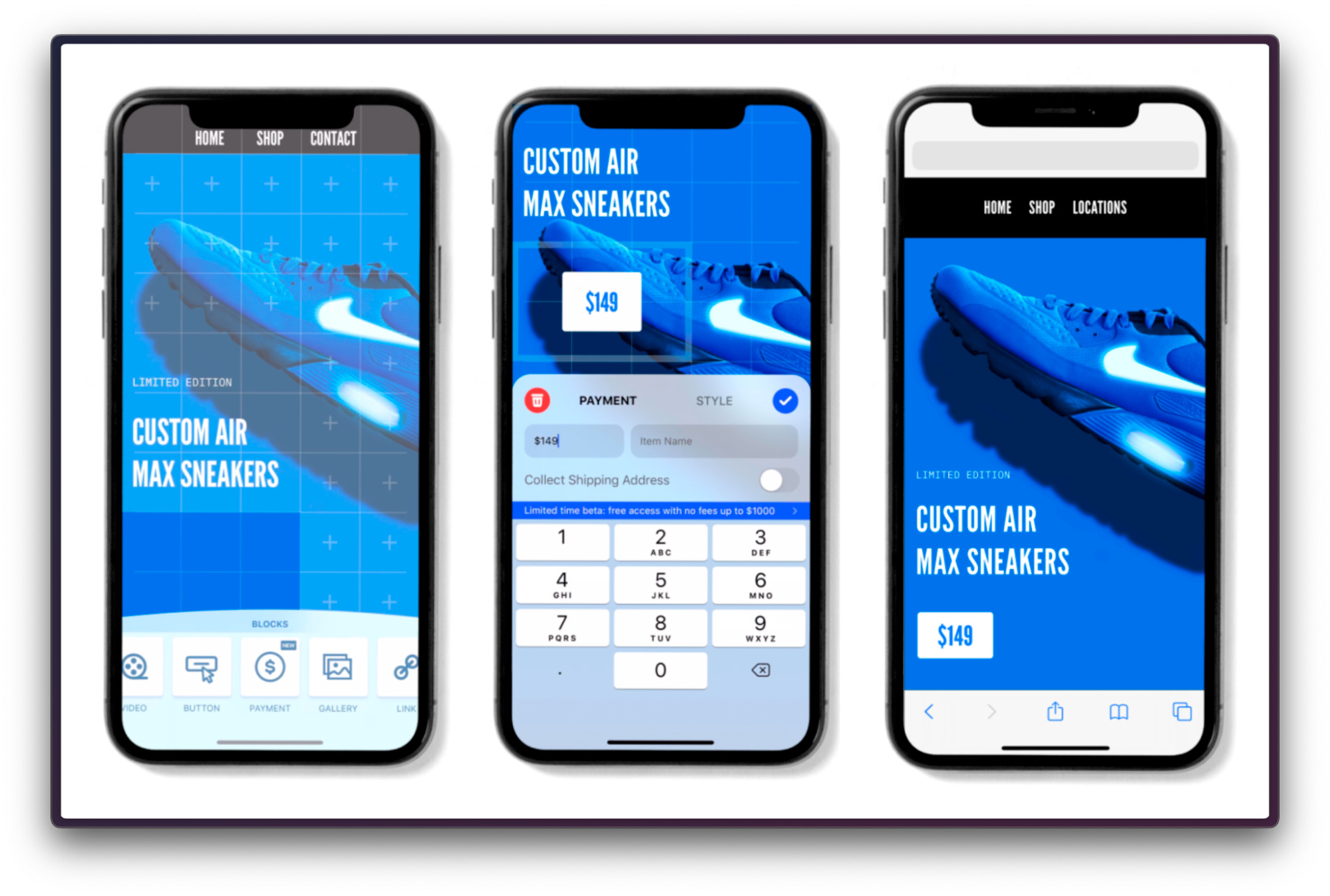
This is a somewhat controversial point, but it is worth mentioning. We're talking about a "sticky" menu that stays at the top or bottom of the screen even when scrolling. This is very convenient for the user, because you can go to another section at any time or, for example, open the shopping cart. On the other hand, such a menu constantly occupies part of the screen space, which can really cause inconvenience on devices with small displays. Therefore, it is up to you to decide how to act.
So is it possible to create a "perfectly" optimized mobile site?
Actually no. There are no "gold standards" for mobile web development. And even if you manage to optimize the site just now according to absolutely all current criteria, there are no guarantees that they will not change after some time.
You and I are in a very dynamic Internet environment that is constantly changing. Therefore, the best strategy is to adapt to such changes in a timely manner. This is the only way to maintain the site at the proper level, optimizing it and improving the user experience.
Mistakes in web development are normal. The main thing is to find and correct them in a timely manner. This is the only way to effectively reduce the bounce rate, increase conversions and improve positions in search results.
We wish you success!





It's free and takes 2 minutes. There are 1500+ digital agencies in the catalog that are ready to help in the implementation of your tasks. Choose and save up to 30% on time and budget!